
No. 77-2-4,No.13 Road,Shenyang Economic And Technological Development Zone,Liaoning Province,China.
Telephone:+86-130 32458698
No. 77-2-4,No.13 Road,Shenyang Economic And Technological Development Zone,Liaoning Province,China. +86-130 32458698 [email protected]
From time to time we will encounter some situations, to go to some places when you find that you do not know how to go, in the indoor space can not find a specific location, can not identify the direction and so on this kind of lost experience, sometimes you may spit out the place there is no signage, and sometimes may laugh at themselves without a sense of direction, but, have you ever thought that maybe the place of the visual guide system, not well-designed it. But, have you ever thought that maybe this place guidance system is not well designed? Today, to talk to you about our daily life in the most common but most likely to be ignored, guidance design.
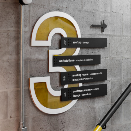
In fact, the visual guidance design, is a use of readable text or symbols, for the space or a large environmental information visualization, more common like road signs, hospital floor information, etc., but now people for the environment and space expansion more and more complex, people for the environment and space information awareness and processing has become particularly important, in the intricate subway interchange, how to find their own subway to ride, how to locate their own direction in the community of high-rise buildings, which are needed to help people solve the problem of visual guidance system. In the intricate subway transfer station, how can people accurately find the subway they want to take, in the high-rise community, how can people locate their own direction, this is the need for the guidance system to help people solve the problem.
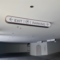
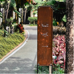
On this basis, the design of visual guidance system can also make use of different materials or clever design to beautify the space and enhance the sense of atmosphere of the whole environment. Nowadays, even some well-designed visual guidance system with independent visual language can improve the recognition of the brand of the same visual language at the same time. It can be said that the design of visual guide system is not only a visual presentation requirements, but also need to consider the space, environment, people, communication, and even sustainability of a design category.
Should a lot of students will sometimes raise some questions, we see the daily common work area of the signage guide, why not like the market packaging or wall painting as visually rich and varied forms? This is to mention the most important point of the visual guidance system, that is, clearly identifiable, and has the function of conveying information or instructions, which is why we commonly see the visual guide signs are very eye-catching, bright colors, or text font size and so on.
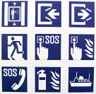
These in fact have a set of international public information symbols graphic standards, such as red for prohibition, yellow for warning, blue for instructions, etc., such a unified standard, such as some of the graphic text on the guide, as well, need to facilitate the public recognition of cognition, so as to avoid different cultural backgrounds of people because of the voice problem or the cultural background of the problem caused by the recognition of the obstacles.

For example, symbols like the ones mentioned above have broad cognitive value and do not generate significant ambiguity. This also leads to significant limitations in the design of signage, making it difficult to do a lot of visual optimization. However, it is precisely because of such standards and a unified understanding of some graphic symbols that we can distinguish our direction even in foreign countries with different languages based on some colors and symbols.
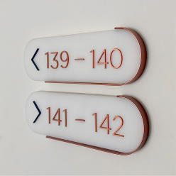
Of course, in addition to consider the Fan with the crowd, but also at the same time need to take into account some special groups, such as children, disabled people, and so on. Like last year's epidemic, in order to avoid contact, I believe we have experienced the use of paper towels in the elevator, toothpicks and other methods to avoid the risk of cross-infection, but a shopping mall in Thailand which is used in the form of a foot pedal, freeing up everyone's hands, only need to go to step on the corresponding number of foot pedals, you can get to the floor you want to go to, and at the same time, in order to maintain the social distance, the surface of a few blue markers, but also a clear indication of the direction and location of where people can stand. At the same time, in order to maintain the social distance, several blue markings on the ground surface also clearly indicate the direction and position where people can stand.
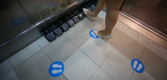
A shopping mall in Thailand
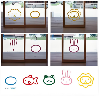
Like last year's epidemic this kind of special situation, children are also need to take into account the “special” people, for example, the new village is for kindergarten design of the guidance system, on the one hand, taking into account the height of the children, the graphics will be decorated in the children's line of sight within the scope, at the same time, in order to protect the children do not accidentally hit the glass in the run, the graphic will be disassembled! Separately affixed to the glass, not only to avoid the risk of accidentally hitting the glass, the graphics are very cute in line with the preferences of small children.
At the same time, the interaction between the glass door and the graphic is also very interesting. Of course, for children's guidance design there are many interesting forms, such as the use of color or common animals or fruits for classification. The main reason is that children are not familiar with some words and symbols, so many kindergartens or children's institutions will choose the color that children understand better, and they are interested in common animals and fruits for classification.
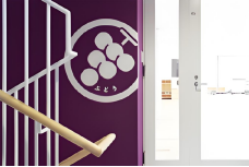
For example, the Bushitsu team made a signage guide for a kindergarten, using large blocks of color for color zone zoning and naming the different zones with corresponding fruits, which increases recognition for preschoolers and facilitates the teacher's delivery of commands in a way that is convenient but not overly serious.
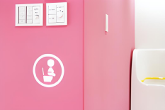
In addition to children, in recent years, with the increase in the number of people with pets, a number of regions or organizations have also launched services to facilitate people with pets, and the guidance design is also followed by the implementation of the theme of services, such as 6D Studio for a hotel for people with dogs and the development of the guide system.
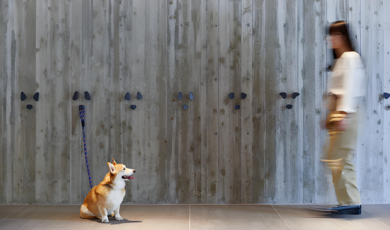
Based on the graphics of the dog's paws for the design, not only cute, but also has the role of can be attached to the leash, at the same time, the use of different colors will be designed for the owner and the dog guide separation, so that the owner can be clear to separate the needs of people and pets space, those places are for pets, and those places can be the owner and pets together with the shared one scene.
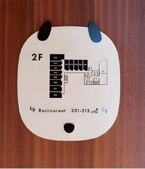
It solves a lot of pain points for pet lovers to travel, and the guide specifically designed for the height of the pet's sight is full of human touch and also allows people to see at a glance the purpose of these signs. Because the use of dog image graphics as part of the guide, to the guidance system adds a lot of fun, at the same time, but also at the same time to improve the recognition of the hotel brand. It's a two-for-one solution.